Nike Product Walls
Sep ‘21
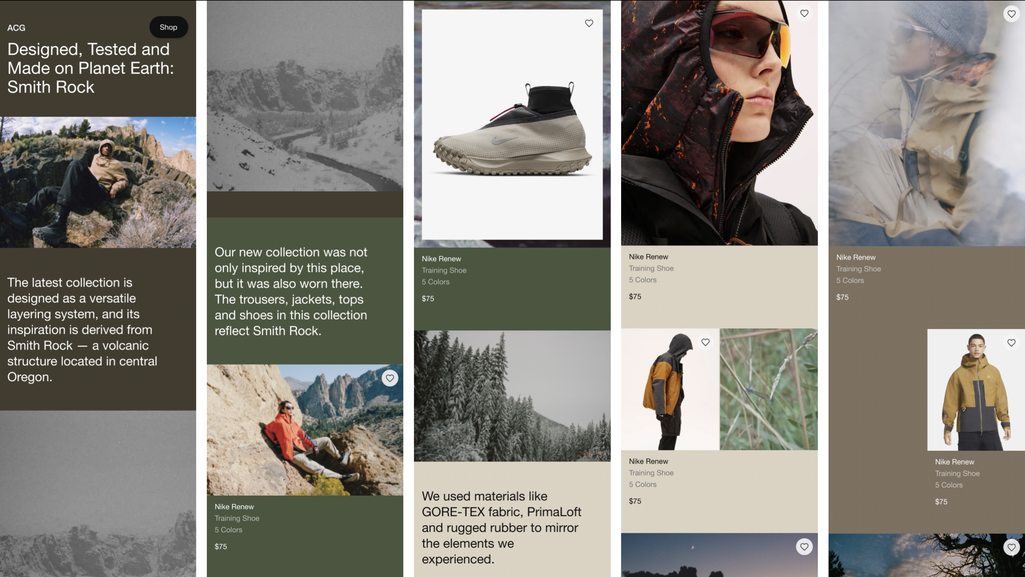
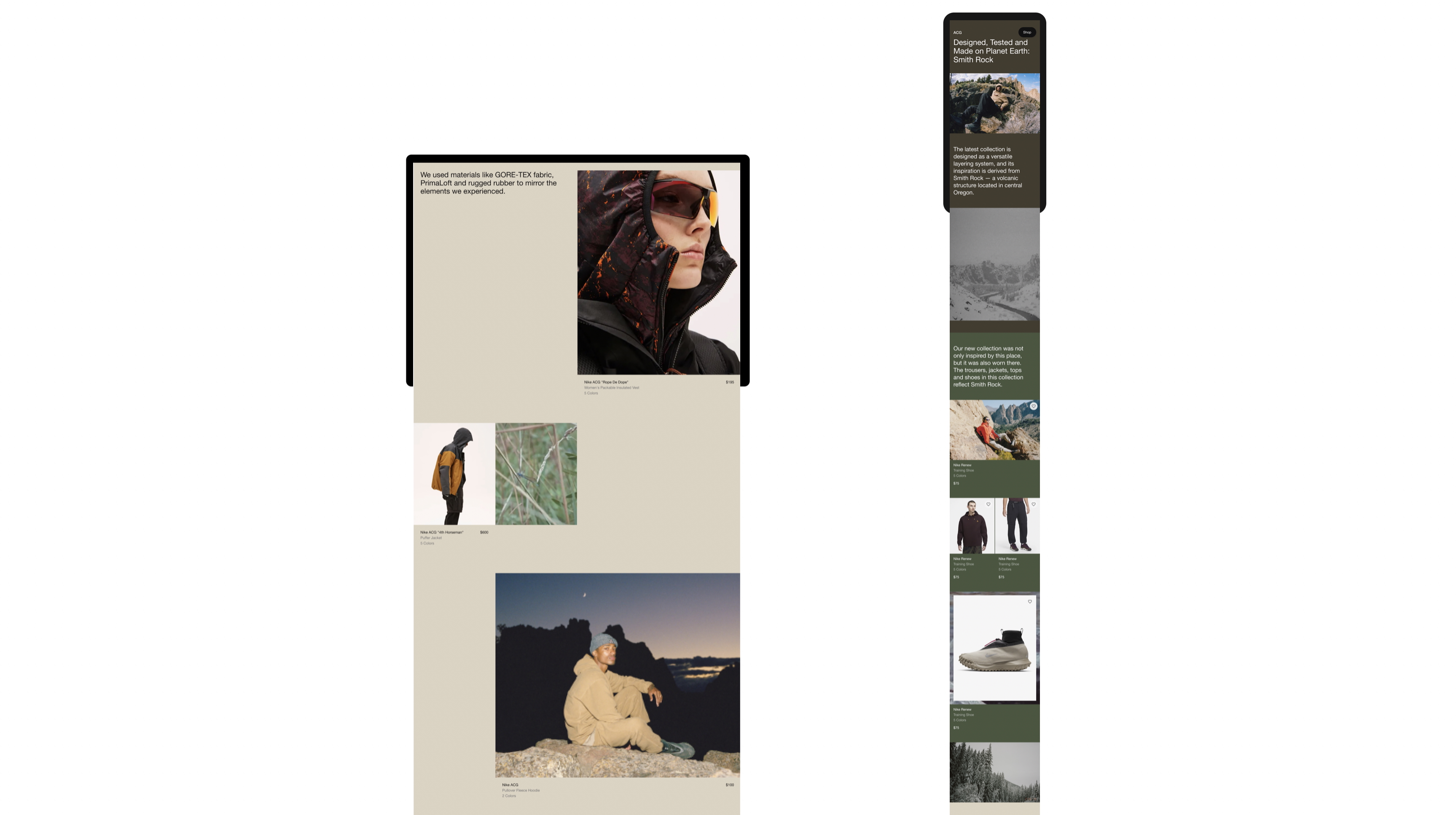
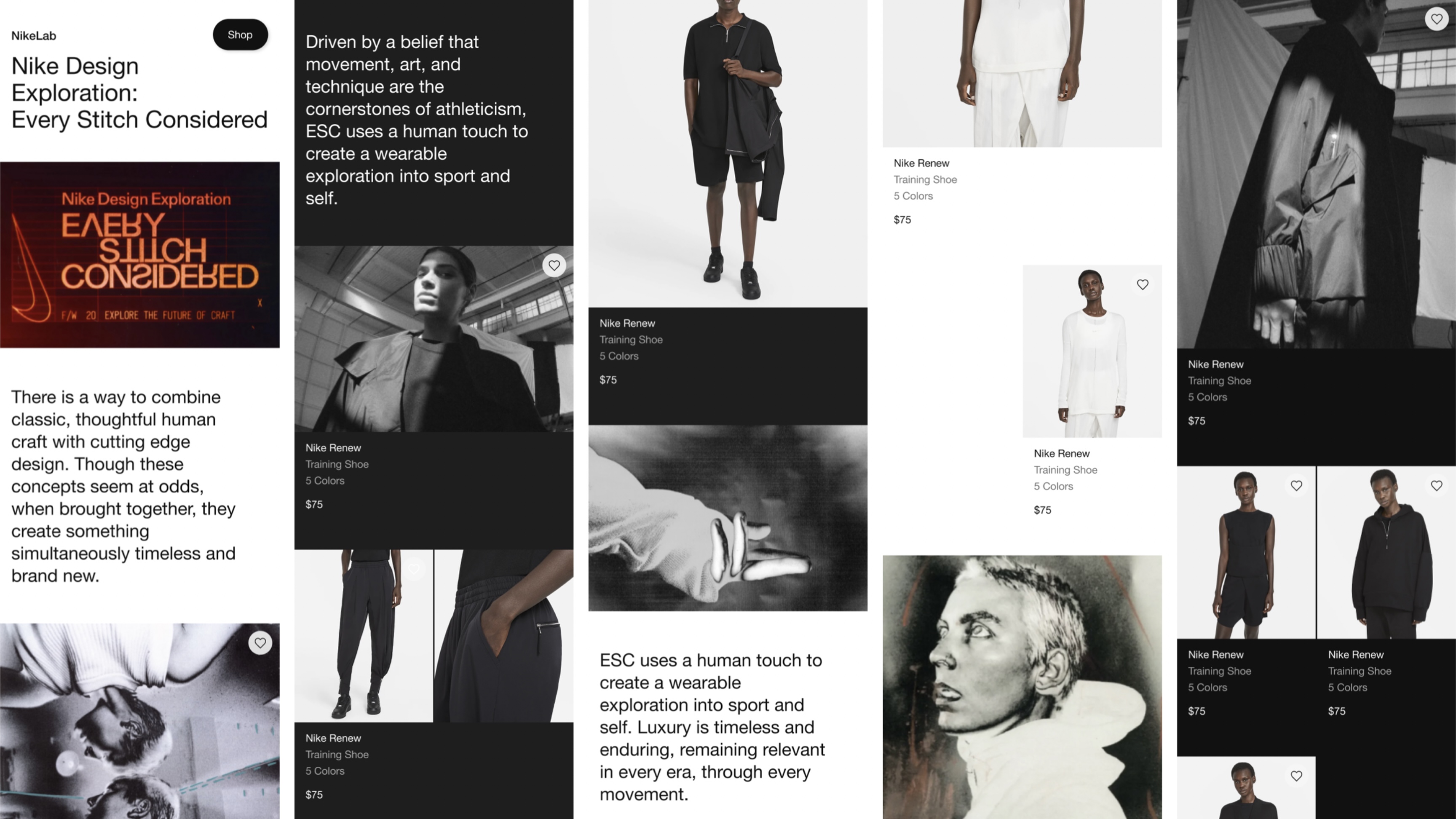
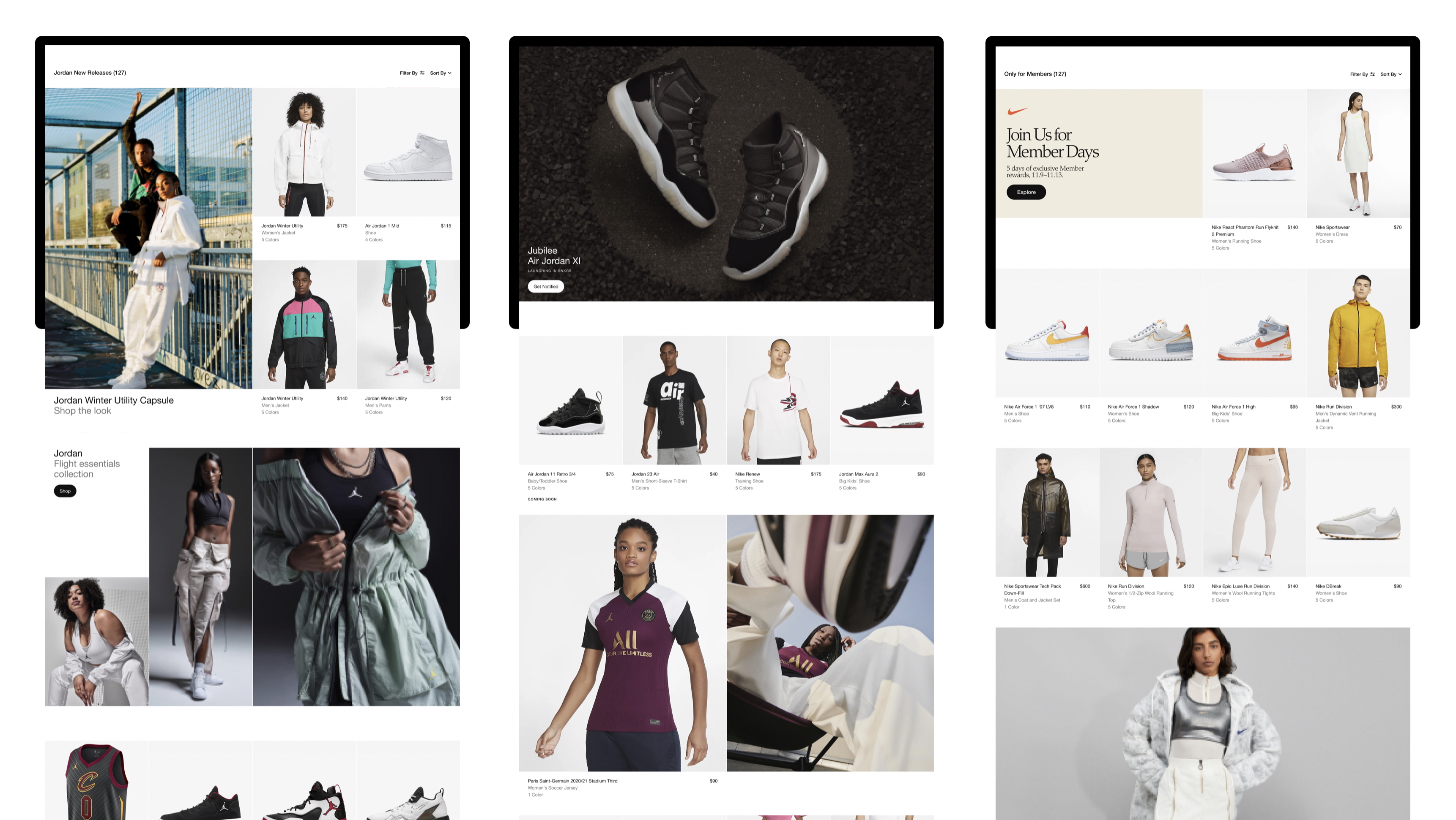
Our vision was to reimagine the Nike App and Nike.com product walls, moving from a flat, homogeneous grid to an experience that feels intuitive, dynamic, and tailored to each shopper’s interests. We wanted users to quickly find what resonates with them—performance needs, personal style, or new seasonal drops—while giving Nike a stronger and more flexible canvas to highlight its latest offerings.
This meant elevating how people browse: richer ways to connect with product, more contextual storytelling, and more efficient purchase paths that reduce reliance on the traditional PDP.
Co-directed with: Thomas Guy
Agency Support: Work & Co
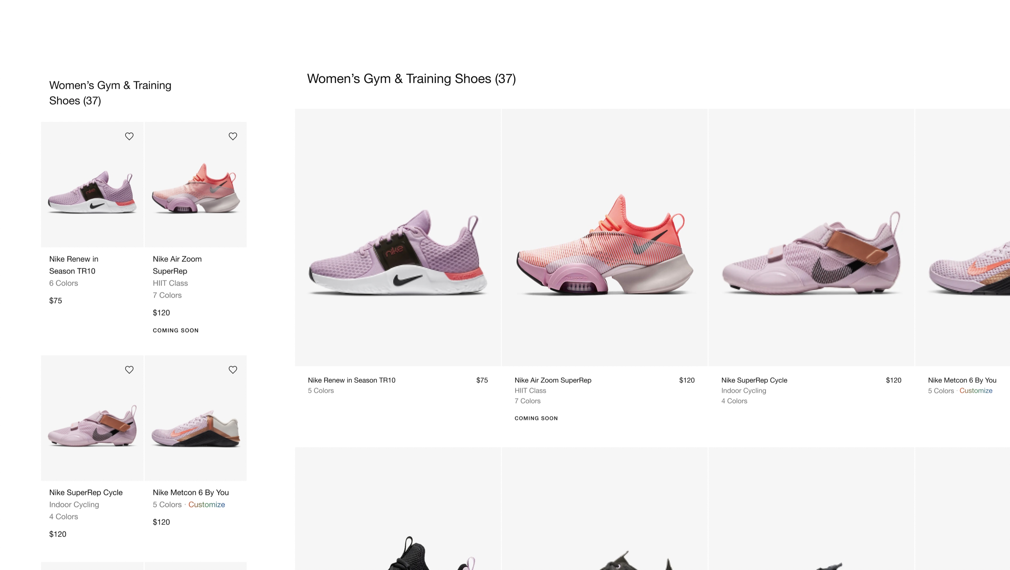
Quick Views & Product Grids
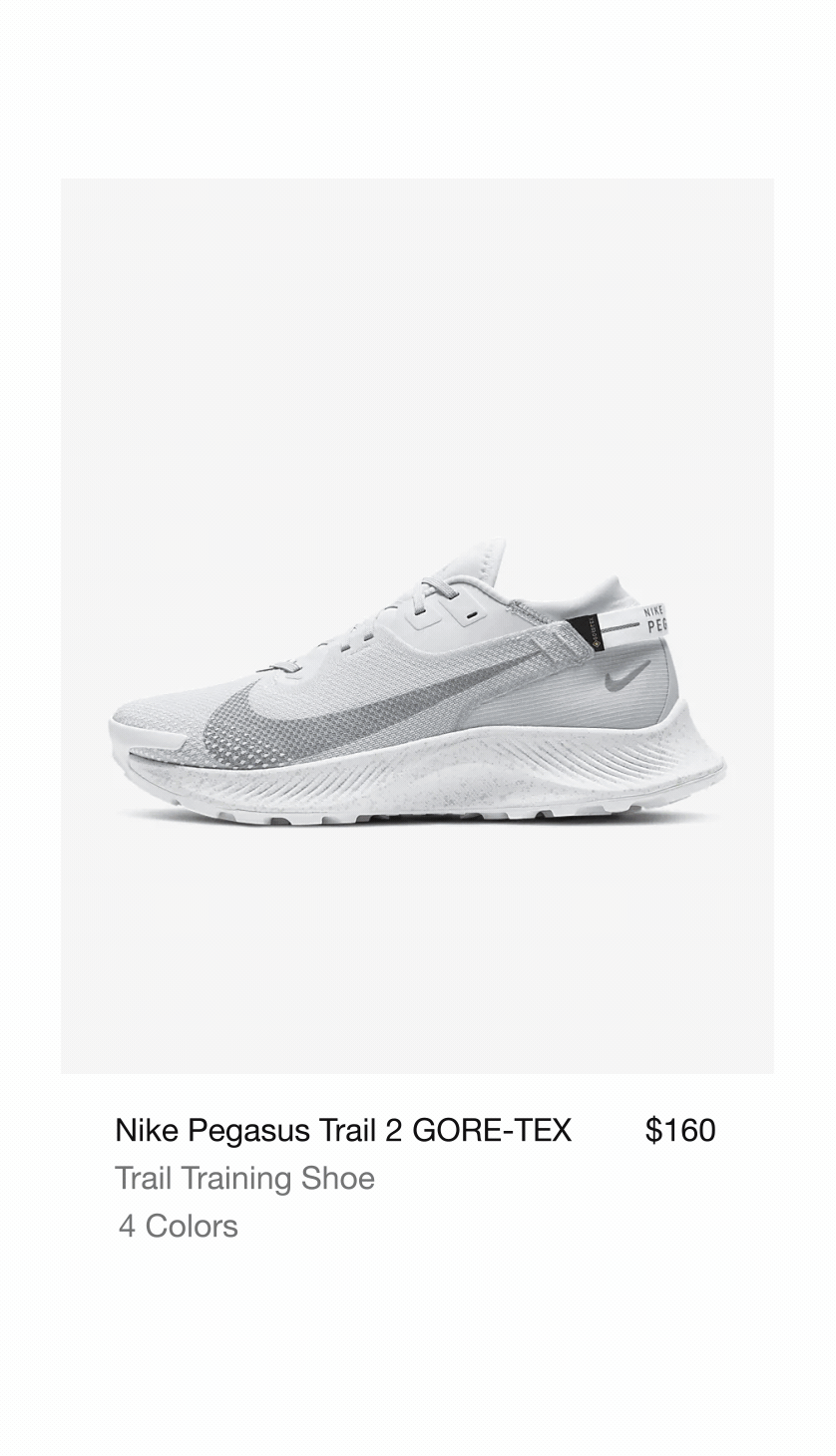
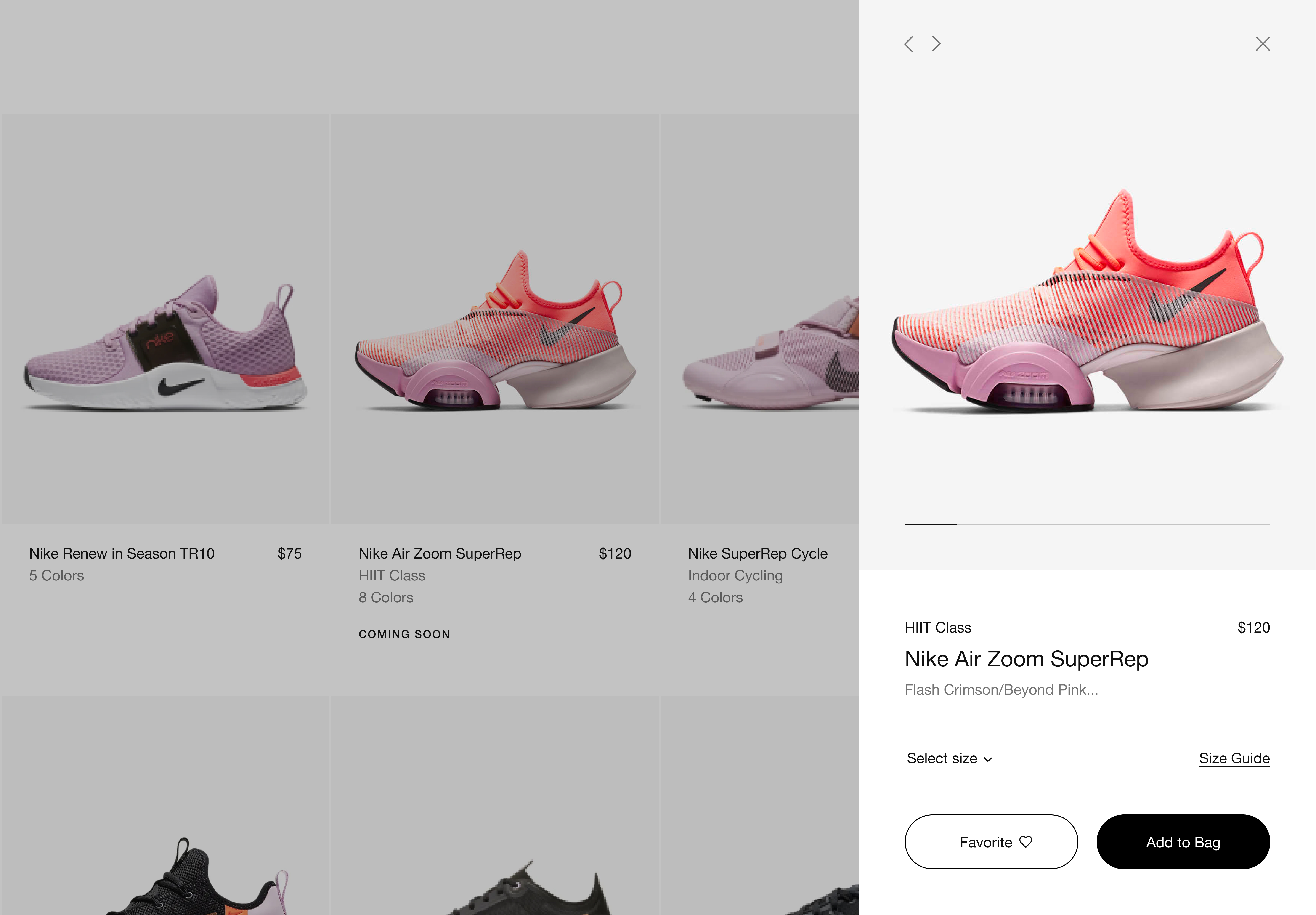
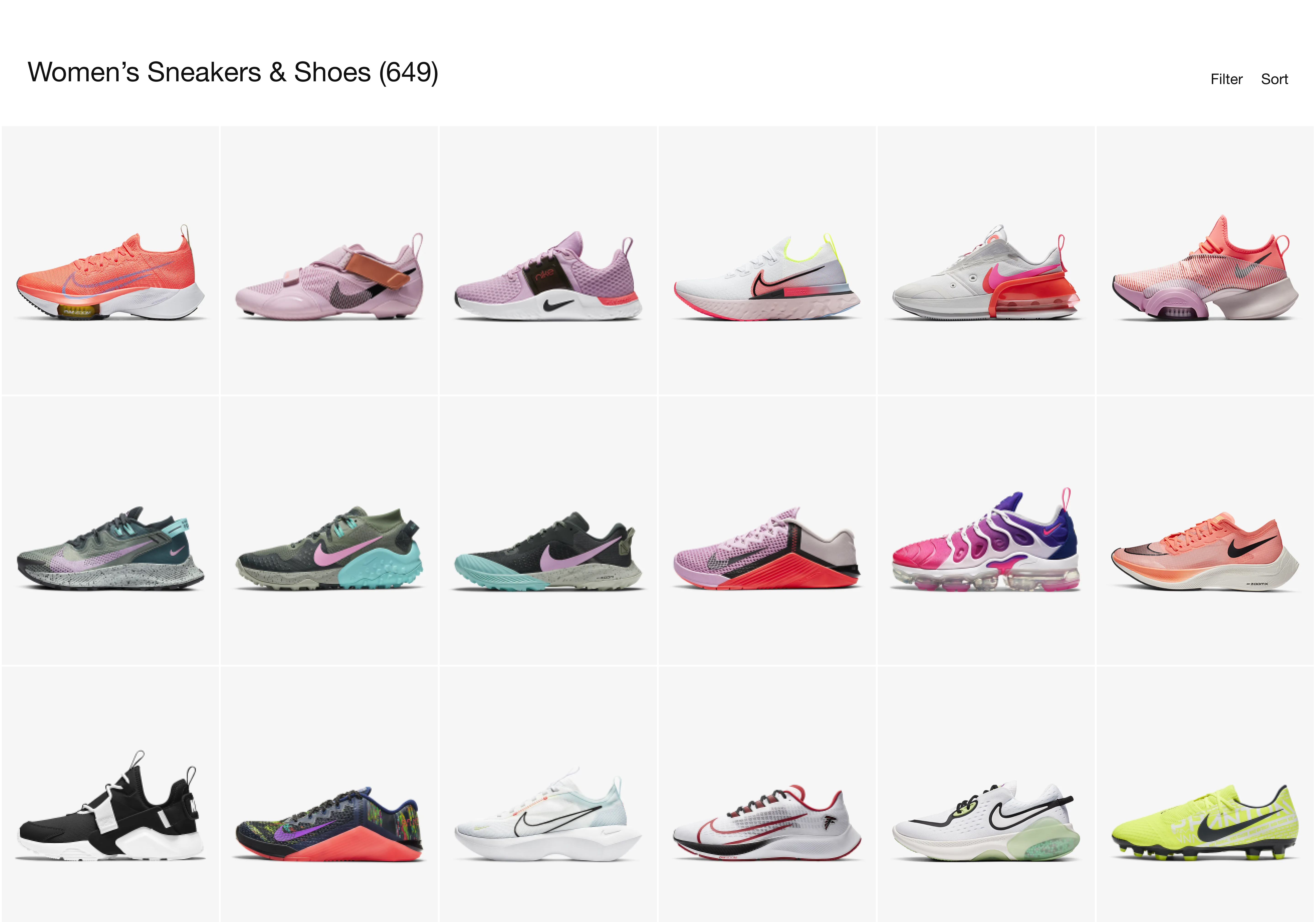
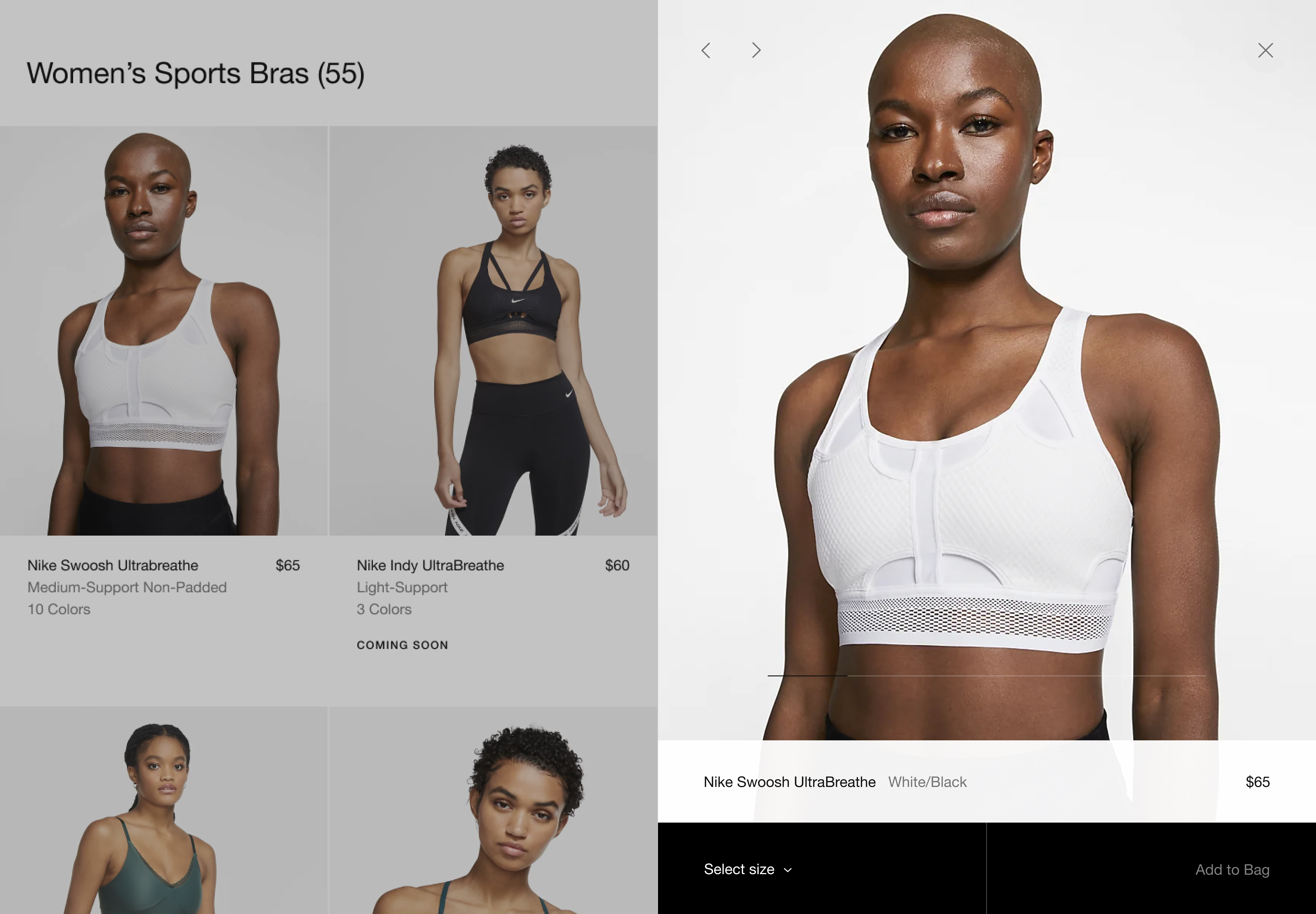
Flexibility and speed were core principles. Shoppers can now select their size, choose colors, and add to bag directly from the grid, eliminating the need to visit a PDP when they don’t have to. We also introduced adjustable grid views that let users decide how much they want to see at a glance, reducing visual noise and making it easier to compare products side-by-side from a styling perspective.
Design System
We built a modular product-card system that establishes how information and imagery are structured across the entire ecosystem. From the hierarchy of required details to imagery and video treatments, badging, interaction patterns, grid behaviors, photography, and promotional content, every component was designed intentionally to create a cohesive and scalable shopping experience.